Part II: Matplotlib#
3. Matplotlib#
Matplotlib is the most popular plotting library for Python.
We will take a look at several examples below, but the Matplotlib gallery is a great place to search for snippets of code to make your plots look professional.
3.1 Importing Matplotlib#
To use Matplotlib, we first need to import it. Matplotlib has many sub-packages, so we will import the pyplot sub-package.
# Import matplotlib
from matplotlib import pyplot as plt

# Import numpy again too
import numpy as np
Now let’s plot some graphs. To plot a graph, you will need x coordinates and y coordinates.
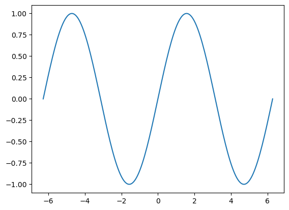
Let’s plot a sine wave. We can use NumPy to do all sorts of mathematical operations, like computing the sine of a variable.
# Create our x coordinates (note the np.sine() function takes radians as an input)
x = np.linspace(-2*np.pi, 2*np.pi, 200)

# Our y will simply be sin(x)
y = np.sin(x)
We now have our x and y coordinates - we can plot the graph. What do you think it will look like?
# Make a simple line plot
plt.plot(x, y)
Show code cell output
[<matplotlib.lines.Line2D at 0x1135a30a0>]
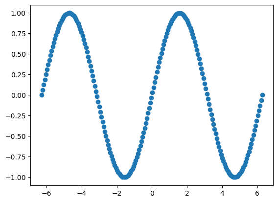
There is so much styling of plots that you can do and we will by no means cover everything, but we will take a look at a few of the available options.
First, we can change the line to a series of points using markers:
# Make a simple plot using markers ('o')
plt.plot(x, y, 'o')
Show code cell output
[<matplotlib.lines.Line2D at 0x11374aec0>]
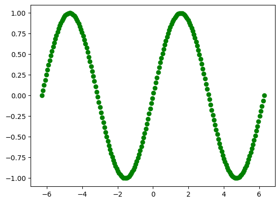
The default plotting colour is blue, but you can change this. Below I have changed the colour - can you guess what colour will appear based on the code?
# Make a simple plot using green markers
plt.plot(x, y, 'go')
Show code cell output
[<matplotlib.lines.Line2D at 0x1137c7b50>]
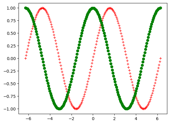
What will the next example look like?
# Make a simple plot using red markers
plt.plot(x, y, 'r+')
Show code cell output
[<matplotlib.lines.Line2D at 0x11382fd60>]
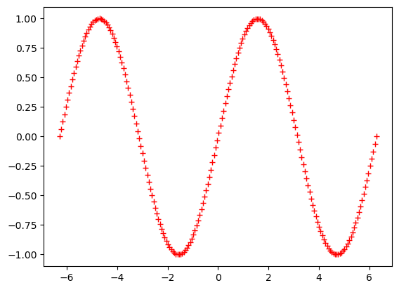
The syntax used above to style our plots uses a format string:
Format string
Format string is with the format of fmt = ‘[color][marker][line]’ For example, r+ simply means red with + marker. Full documentation can be found at this link under Notes secion. You can plot multiple sets of data on the same graph.
# Plot with two curves
plt.plot(x, y, 'r+')
plt.plot(x, np.cos(x), 'go', linewidth=4)
Show code cell output
[<matplotlib.lines.Line2D at 0x1138cca00>]
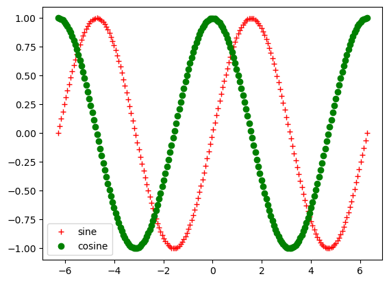
If we have two or more curves in the same plot, as above, how can we convey to the reader which line is which? We can use legends. To use a legend in Matplotlib, you indicate the legend label in the plotting command and then invoke the legend function separately include the legend in the plot.
# Plot with two curves and a legend
plt.plot(x, y, 'r+', label="sine")
plt.plot(x, np.cos(x), 'go', linewidth=4, label="cosine")
plt.legend(loc="lower left")
<matplotlib.legend.Legend at 0x1139290f0>
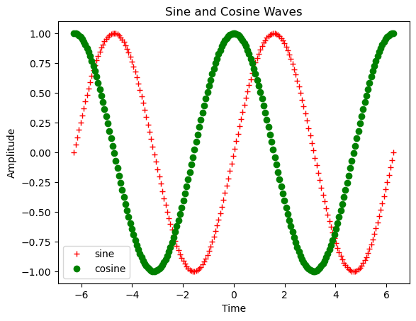
Finally, no plot is complete without a title and labels on the axes. Let’s take a look at how to add these.
# Plot with two curves, a legend and labels
plt.plot(x, y, 'r+', label="sine")
plt.plot(x, np.cos(x), 'go', linewidth=4, label="cosine")
plt.legend(loc="lower left")

# add labels
plt.title("Sine and Cosine Waves")
plt.ylabel("Amplitude")
plt.xlabel("Time")
Text(0.5, 0, 'Time')
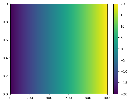
1.3 Plotting 2-Dimensions#
Since NumPy is all about multi-dimensional data, we will now take a look at how to create 2-D plots. We will first make some plots using simple arrays and then we’ll take a look at some real data in the next section.
# create three arrays, a, b and mesh
a = np.ones((1,1000))
b = np.linspace(-20, 20, 1000)
print(a.shape, b.shape)
mesh = a * b
print(mesh.shape)
(1, 1000) (1000,)
(1, 1000)
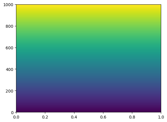
# plot mesh in in 2-D
plt.pcolormesh(mesh)
plt.colorbar()
<matplotlib.colorbar.Colorbar at 0x113a34760>
# Use meshgrid to create arrays (https://docs.scipy.org/doc/numpy/reference/generated/numpy.meshgrid.html)
mesh_b = np.ones((1,1000)) * np.linspace(-20, 20, 1000)
print(mesh_b.shape)
xx, yy = np.meshgrid(mesh, mesh_b)
print(xx.shape,yy.shape)
mesh_c = xx * yy
print(mesh_c.shape)
(1, 1000)
(1000, 1000) (1000, 1000)
(1000, 1000)
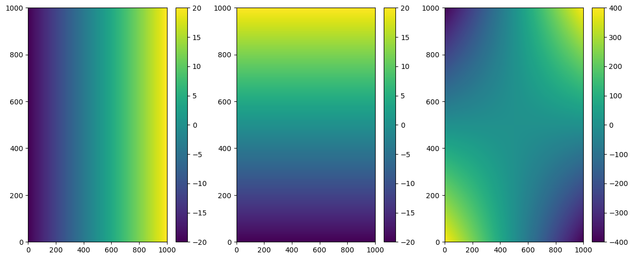
To better understand what meshgrid is doing, let’s plot xx, yy and mesh_c independently using subplots.
# plot xx, yy, mesh_c in 2-D
fig = plt.figure(figsize=(15,6))

# plot xx
plt.subplot(1,3,1)
plt.pcolormesh(xx)
plt.colorbar()

# plot yy
plt.subplot(1,3,2)
plt.pcolormesh(yy)
plt.colorbar()

# plot mesh_c
plt.subplot(1,3,3)
plt.pcolormesh(mesh_c)
plt.colorbar()
<matplotlib.colorbar.Colorbar at 0x113bfb820>
# Plot the transpose
plt.pcolormesh(mesh.T)
<matplotlib.collections.QuadMesh at 0x113d1e200>
There are many more operations you can do to arrays. Many of them are very intuitive, you don’t even need a reference :).
np.meshgrid(ndarray, ndarray)np.reshape(ndarray, shape)np.resize(ndarray, size)np.tile(ndarray, reps)ndarray.sum()ndarray.mean()ndarray.std()plt.plot(x, y)
You can find the full NumPy reference here
We will take a look at some other plotting options in the next exercise.